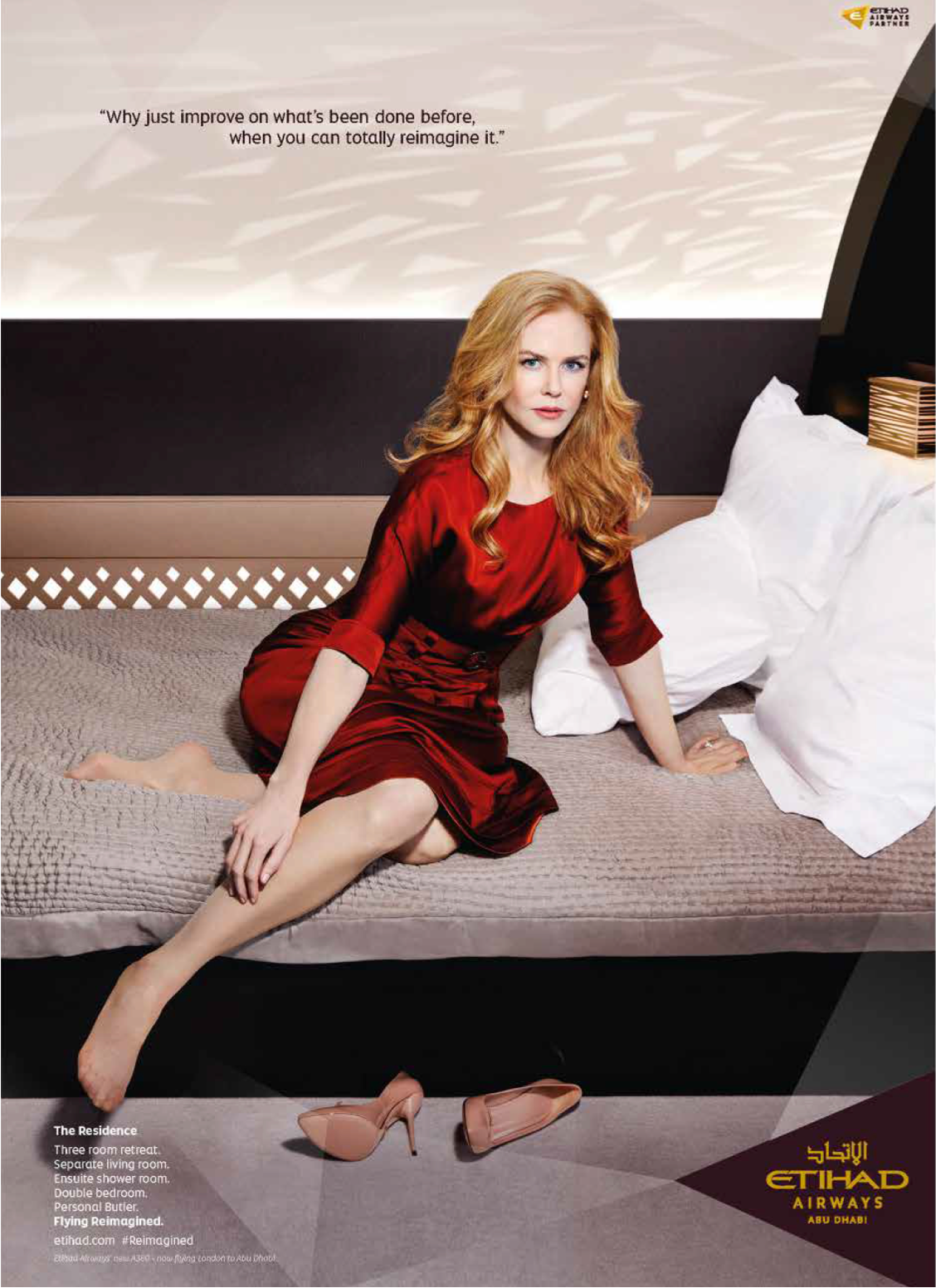
Custom fonts capture the brand essence of Etihad Airways
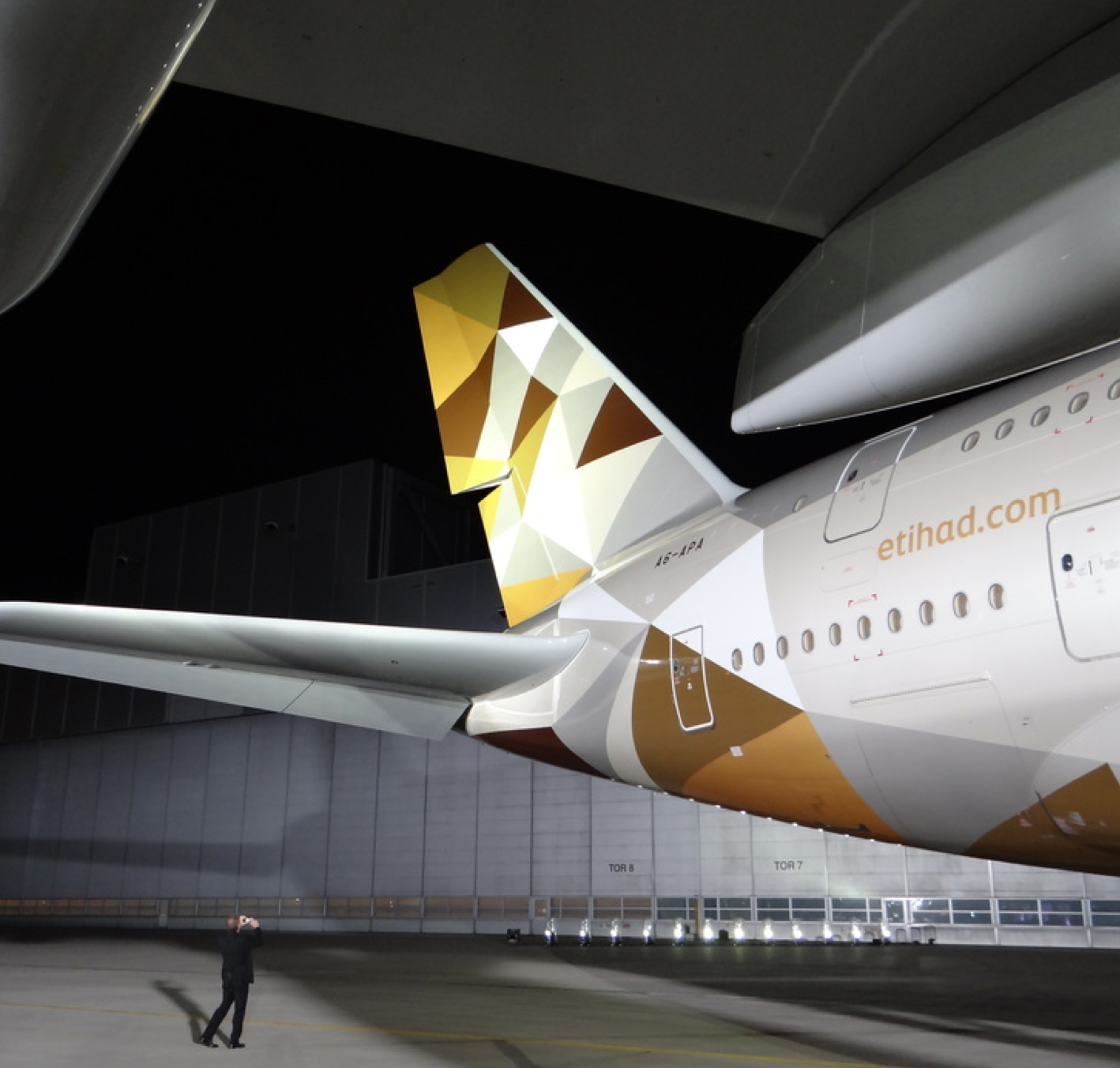

When Etihad Airways went through an extensive rebranding in 2013, Typolar desiged a tailored global use font family for them. The font family is based on Typolar’s Altis, which already met most requirements of the brand. Altis gives a very friendly impression, which translates into well-being and hospitability in the branding materials of the airliner.
Clarity and functionality, which come from the original font design, ensure that the font family works well in multi-channel communication. These qualities are achieved with a design concept inspired by European humanistic sanserifs from the early 20th century. Combined with proportions that help visibility at small sizes, like in body copy, buttons or links, Altis is a highly accessible font.
Many details of the original Altis design were updated. We swapped some characters with their alternative forms and streamlined line-endings to match other elements in the visual identity. With these customisations, the Etihad Altis font family is even more recogniseable in advertising materials, and it is highly readable for any digital or print touchpoint.
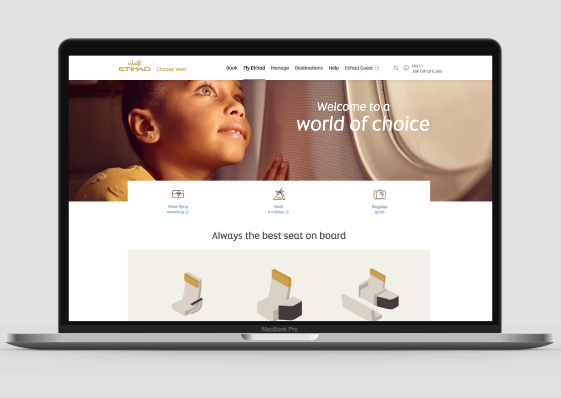

A good user experience, especially in digital, requires clarity from the type. But, to clearly identify the brand through typography also requires distinct visual attention points from the font design. Etihad Altis leverages both of these capabilities to best fulfil its communicative mission in commercial use.
Global communication means using several language systems. Etihad typography combines, for example, the different aesthetics of Latin and Arabic letters, which are often used side by side in brand materials. We have taken this need into account when designing the Etihad Altis. As the brand's base typeface, it creates a smooth visual harmony with the complementary typefaces used in other scripts.


Several visual cues of Etihad's visual brand identity are embedded in the letterforms. The diagonally cut line endings reflect the character of the Etihad logo and act as a glue between brand's visual materials. Sharp patterns remind us of the value proposition of the luxury level. This motif moves from graphic templates to the interior details of the fleet.
With custom fonts, luxury comes through equally well in stylish ads with Hollywood celebrities or sweaty team jerseys of one of the best football teams in the world.